Believe it or not, the most pushback I get on Social Media is when I make a statement regarding proper drawing proportions.
Some of my detractors may be tilting at me because they are warriors for the “body positivity” movement; folks who make a show of offence at the notion of idealized figures per se. These sorts have attacked me, but you’d be wrong to think that they are the group most incentivized to challenge my points.
The most dedicated and tedious arguments I get are from people who identify themselves as ‘artists’, especially those who are also in the subset of ‘fan’. The fact that they identify as artists is important to consider. These are not people who have the professional mindset- they are not professional illustrators. These are fan-artists mostly, and/or people who produce some paid work sporadically, but it is always done thru their fan lens.
The amateur and fan-artists seek to argue against my points, all as a result of the same phenomena :
My presentation of Andrew Loomis’ rules, challenge their own pet practices.
The attack regarding figure proportion takes on three forms generally:
- The Fan Attack
- The Fudged Arrangement Attack
- The Denial Attack
The Fan Attack
This is the type of detractor who seeks to prove the Idealized, Fashion or Heroic proportions are not used by a specific feted artist, one whose work they admire, and thus I (and Andrew Loomis are) wrong. The essential point is something like the following:
Artist X used this proportion… Artist X is awesome…therefore you are wrong.
Notice there is no reason given beyond “artist x is awesome” as to why we should use the proportions which may, or may not, be attributed to that artist’s figure work. Andrew Loomis does give us reasons why stretching the figure psychologically makes it more pleasing to look at. He also notes that such knowledge was well-known by the artisans of old, who applied the same rules to classical sculptures.

The reality is that it is irrelevant whether you believe Frank Frazetta or Mark Schultz or any other artist is awesome. They can be very fine technicians, and also fail to represent their figures with proper proportions. It doesn’t matter how many covers they have done, or how long they have been in the business. The work speaks for itself, when it is observed and measured properly. This leads us to the second form of detraction, which is…
The Fudged Arrangement Attack
Amateur detractors try to quibble with assertions regarding proportion often by fudging their measurements, or using anatomical twists and/or head tilt to make the initial measuring head unit faulty. I generally feel there is no real purpose in engaging with such detractors, since social media folks mostly have no volition to actually learn. Instead, they are ‘beam-breaking’ (that is trying to dissemble the assertion I am publicly making) simply because they don’t like seeing certainty in other people. It challenges the insecurity within their very personal core. Beam-breakers thrive on breaking, and seldom make anything themselves.
For the sake of this blog, I will show you the way to disprove this Fudged Arrangement Attack. The reason why the faulty measurement and fudged unit argument is false is that simply cheating the head unit does not allow you to cheat the marker placements of the other parts. When the ratio of 8.5 heads is applied, the anatomical parts always hit in the same place. If you are using a false measurement, the points will fall incorrectly.
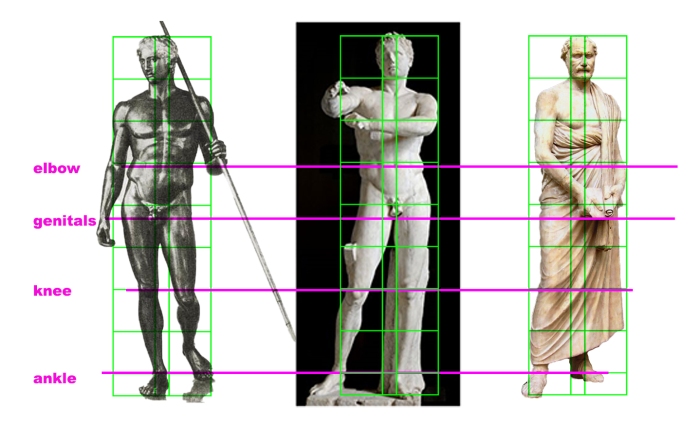
In this demonstration, I have lined up the wounded Amazon, with my drawing of 8.5 head figure and an enlarged to height 7.5 head figure, which I also drew. The 7.5 proportion drawing has been resized to fit, but not stretched or squashed in any way.

This is done to prove that anatomical parts within the array of the 8.5 head figure will not line up with those of the 7.5 head figure up and down the body.

Amateurs who fudge the measurements, and pretend the head is a different size, will be revealed when their unit markers line up consistent with one of Andrew Loomis’ displays of figure proportions (which I have copied and shown in previous lessons). These cross points tell the story. This is how I can tell the head-count on figures which only have certain parts of the anatomy showing, or likewise, I can tell the count if the figure has been even cropped such that no head is displayed.
The trained eye can see the relationship between shoulder, elbow, genitals knees and ankles. You don’t need the head to be able to see this. The greater number of head units spread this relationship out, and the fewer units squash the figure closer together. This is why the amateur fudging of arrangement of unit size does not work.
The Denial Attack
This is the most foolish type of attack, where the detractor denies the premise entirely, or brings in false claims about Andrew Loomis’ basic assertion that slightly elongating the figure looks better.
I have been confronted with claims that the “Fashion Proportion” is intended to show-off clothing (because the word ‘fashion’ is used), and that such stretching looks wrong when the figure is unclothed. The Classical statues presented above debunk this claim.
I have also been challenged with an attack that basically says, “Well I like it this squat way, it looks better to me!” This is pure relativism, and furthermore, it isn’t a legitimate point anyways. This last demonstration will show you why.
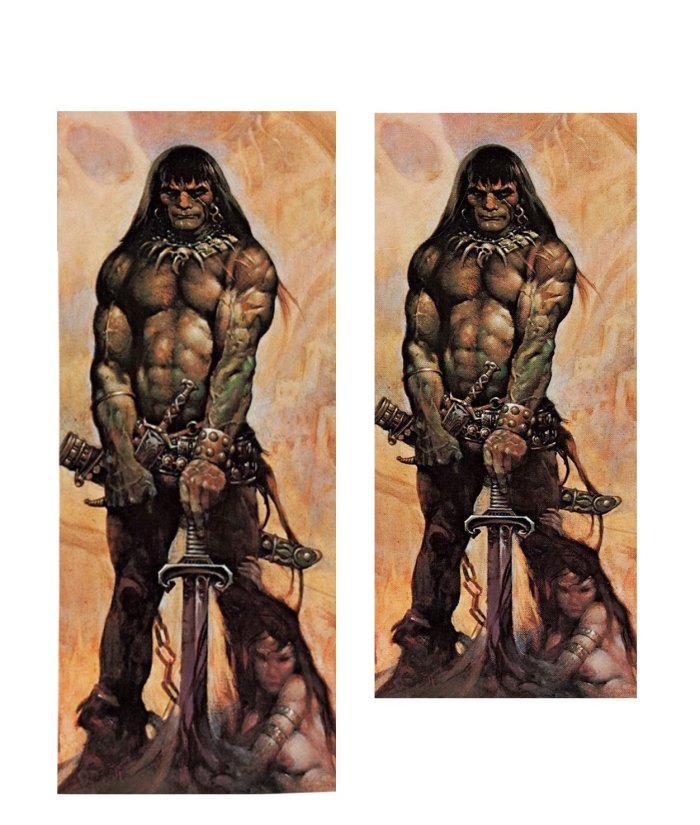
Here are two examples of Conan the Avenger, by Frank Frazetta. All of my audience should know this painting, even with the most of it masked off as it is with my black layer.
When revealed, one will be presented as Frank painted it, and the other you will see has been altered to change its proportions. You will immediately see how the figures compare to one another, and how altering the ratio can totally change the look.

Observe how the heads are the exact same size, as shown in the masked example. By changing the proportions, we as viewers ‘read’ a totally different figure. The head unit as the anchor for the relationship between the points of anatomy, and the amount of these units used to describe the anatomy are the determining factors. One looks more impressive than the other.
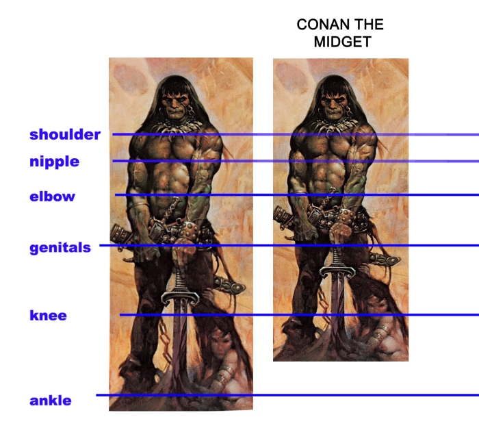
You can see the figure on the right fails to meet the cross-points which describe the other figure’s proportions. The ‘midget’ Conan has all his constituent parts closer together, giving him a squat look.

Comparing the painting to my drawing of 8.5 heads, you can see the anatomical parts line up almost exactly. If the ‘midget’ Conan were resized, constraining the dimensions so that he is exactly the same height as the 8.5 head man, the cross-lines will not conform with the size of the head unit. This ‘midget’ figure has too big of a head for the rest of the body.
The point of this section was to reveal how the argument: “Well, I like it that way!” is a false claim. The reason detractors make this claim is because they don’t want to be wrong. As soon as any person makes an assertion about anything, dollars to doughnuts, there will be a detractor immediately there, trying to shoot them down. This is why the Denial Attack is the most silly.
I hope to show you the reason below. Scroll down to see>
Keep going..

Conan the Midget is the real one Frazetta painted.
This is why “I like it that way!” is not only phoney as a reason it is false.
You don’t prefer squat looking figures. Your bias is distorting your ability to see properly.
The reason you don’t see the midget quality in it as a full painting, is because your eye is not trained. You are being effected by all of the beautiful ways Frank has handled the paint, his colours, his design choices and the subject matter. This baffles your ability to measure.
Loomis knows what he is talking about. A stretched out figure looks better because we want to see something idealized, something beyond the human form. This is why the ancients made their figure proportions this way and it is why professional illustrators know this fact.
When I am talking about the rules which illustrators follow, I am considering the profession as Andrew Loomis does: that of a working tradesman who is able to deliver competent art for a variety of customers, in a variety of styles of realism. Andrew Loomis has worked very hard to extract these rules from his professional career, drawing conclusions from clients, agencies, observation and practice. He is candid when he says he has “made every mistake you have made, and more”. The words Loomis puts down are deeply considered, and following a lifetime of professional illustration. They should be heeded, if you are serious about learning the trade of professional illustration.
For an assignment, try to work 3 figures using the three proportions we have learned, the natural of 7.5 Heads, the Idealistic of 8 heads and the so-called Fashion of 8.5 heads. The point is to hit all the anatomical parts in the correct places. Use my samples to help you.
Thanks for reading! See you next week.

I can’t stop noticing Conan the midget on that painting now hahaha
LikeLiked by 1 person
It is astounding isn’t it.
LikeLiked by 1 person
Great post.
LikeLike