Complex forms in light

Complex forms in light

This next section of Understanding Loomis will begin to address the essential question of how an artist can create realistic shadows when a subject matter is not a regular geometric shape, for instance such as in the case of a woman’s face.

Loomis begins his answer to this important question with a short word regarding theory.  He starts with the observation that laypeople cannot tell the difference between talent and knowledge.  He means that when most folks perceive a person of skill executing his craft – be it drawing or drywall- the product may seem like the result of an immaterial gift, rather than the exercising of an integrated, practiced knowledge base.  This is a mainstay of fine-art, where the ‘myth of talent’ seeks to delineate a line between craft and art.  The position being held by the talent advocates states that artists are geniuses, and their work is akin to revelation.  These elect few ‘geniuses’  are not craftsmen, but vehicles of expression who’s concepts (opinions and ideas) are purportedly the seat of their greatness.  Loomis being an illustrator reveals this as a myth with the straight-forward observation that talent really is a mis-appellation applied to what really is a practiced craft.  This confusion and elevation of the discipline into the realms of fine-art is done by those who lack knowledge of the pursuit, onto those who have knowledge of that pursuit; that is the ability to draw and paint.

Loomis defends the position that drawing and painting well, is a matter of understanding the terms of how such a skill is done and that there are specific areas of technical knowledge needed in order to manifest the illusion of reality on a 2-d surface.

Now he goes into the nuts-and-bolts of shadows and complex forms.  Loomis begins this section by indicating that when a drawing or painting is being done, and a smooth tone is chosen to be interrupted by the artist, there are only two ways an observer can interpret that change in tone.

  • That the change in tone represents a change in the character of the surface which is trying to be represented (say for instance, a few small rocks on a wide stretch of beach)

OR

  • That the change in tone is a smudge on the surface of the art, and not part of the image which is trying to be represented.

The interpretation of a dark tone as being a change in surface character within the picture, vs it being some sort of surface smudge is exclusively within the domain of the placement of that mark.  A properly placed, grey mid-tone mark, will read as perfect sfumato of light on a woman’s cheek, where a misplacement of that same mark by a matter of degrees will make it now appear as a dirty spot; a mistake where your hand disturbed the charcoal.

This is a very useful distinction to keep in one’s mind when making a picture, in that many artists are compelled to ‘fill-in’ areas with various marks and tones.  The naive illustrator overly relies on hatching and details because he does not know where the exact place surface changes should naturally occur given the object and the light he is attempting to draw.

Unfortunately, many naive approaches in art can be interpreted as elements of style, and therefore also intentional on the part of the artist.  This conclusion is generally false, and such art is really most often the product of the artist trying to ‘fill in’ the work.  People usually have a good enough eye to see that something is wrong in a picture (see earlier posts on intelligent observation), but they lack the knowledge of why.  When this happens to an artist regarding his own work, the common natural response is to fuss over the area, adding random marks and tones in order to address the error in intelligent observation the artist is experiencing.  For instance, Loomis indicates elsewhere that the appearance of a receded or distended jawline in a portrait, which causes the artist to keep refining the contour of the face, is most often nothing wrong with the jaw, but actually the effect of the artist having misplaced his subject’s features, such as a too-low mouth, or too-wide eyes.

Naive art is often given a pass, and even loved by consumers and the audience in some cases.  Whether intense, ‘stylized’, ultra-detailed and highly-rendered art is your cup-of-tea or not does not change the fact that there is a particular place where surface character changes in regard to light, and knowing those particulars is better than not knowing.

Drawing is only difficult to those who don’t know what information to hold onto when representing a subject.  The placement of contours and changes in the nature of surface character are measurements and nothing else.  When one knows how to measure these properly, the matter of placing them is made simple.

Knowledge over talent.  Know how to do it, don’t try to guess because you can’t.

Moving on, Andrew Loomis declares that to find the planes of an object is to watch the angle of the surface as it changes, then record the tone or value caused by the angle.  I think this is most easy to understand when put in the context of drawing a face.  Loomis wants us to recognize that areas of light on form, always fall into a shape.  So do the dark tones and the half tones.  To be able to represent a face in light is to know these shapes, and place them together properly.

Consider this drawing I have done, presented below:

woman contour face loomis

A face is drawn as any other surface by following the angles of the surface and with each change of plane, noting the change of value.  Highlights are found on the highest parts of the form, and nearest point of the surface to the light.  As you can see in the image above, there is no need for complicated and intense detail.  The value of the shadow tones are limited to only 2 in my picture; full black for shadow, medium grey for half tones.  The brightest parts of the face are represented by no pencil work- it is the paper colour.  Squint your eyes at my drawing and you will see a generalization of the values, and recognize that the mid-tone is basically uniform.  With the magic of photoshop, I reduced my image to only 2 tones and the white ground.  You can still read this as an attractive woman’s face.  This is because the placement of the shadow tones is correct .  We read this as a face, and even an attractive face because the marks are in the correct areas.  If they were moved about, the image would become less attractive.

small contour

Here I have taken the shapes of value, and moved them around a bit, then added a red filter to indicate the distortion.  This example shows how the positioning of the value-tones is the essential variable which artists need to get correct.  The actual ‘prettiness’ of the particular eye or nose drawn is not what makes a woman’s face look attractive.  It is the knowledge of how form creates shadow, and the proper measurement of where the artist chooses to place those values.  

distortedsmall contour

You can see in the red version, the masses of tone when slightly moved, also move in our interpretation of them from descriptions of value to random marks.  The tones appear like surface blemishes.  Look for instance in the halftone mark which describes the edge of the woman’s cheek where it meets the muzzle of the face. The correctly placed one looks just like a shadow, the incorrect one is an unreadable mark -a smudge.

adistortedsmall contour

The obvious next question is how does one learn these various shapes, which represent light on form in regards to the multiplicity of facial angle and quality of light?  The answer will be outlined in the next posting, which will go into the principle that light on form is related to the basic, and memorizable way that light falls on the sphere and the cylinder.

We will discuss this next monday.  I hope you join me.


Perspectival Shadows cast from Before

Last time, we considered the method of showing a proper shadow cast from a light source which is behind the viewer.  This lesson today will demonstrate the opposite situation, where the light source is before the viewer.

Andrew Loomis in his book Successful Drawing shows us the method of solving how to draw shadows in proper perspective.  The first point which needs stating is a concept hinted at from 2 postings past, which I hope to make concrete by the end of this lesson.  The aforementioned idea is that if the light source is Behind, the angle of light is below the horizon.  When the light source is before the viewer, the angle of the light is above the horizon.  Hold onto this thought, and I will review it at the end of the lesson, where I am sure it will form an integration for you.

Here are the steps for casting a perspectival shadow from a light source which is before.

  1. Set up your horizon and the object using proper perspective.  Establish the Vanishing Points for the object’s sides, and draw the appropriate angles.  Draw the guidelines for the perspective on a separate layer of vellum or digitally, then remove the guidelines when the object is perspective. Save the layer.Screen Shot 2019-03-04 at 8.22.41 AMScreen Shot 2019-03-04 at 8.24.58 AM
  2. Since the light source in this exercise is before the viewer, it is proper to next establish the position of where that light is coming from specifically.  This should be done with precision within the layout phase of your drawing.  Even if the light is not going to be within the boundaries of your finish crop for the illustration, you must lay it out with exact placement, or else your shadows will appear unconvincing.  Drop a line vertically down at 90 degrees from the centre of the light source to the horizon line.Screen Shot 2019-03-04 at 8.25.15 AM
  3. The point where the vertical line crosses the horizon will be the VP of the shadows. This is a crucial step, so pay close attention to it.  As a rule, the Vanishing Point of shadows is directly below the light source when the light is cast from a Before placement.  The blue lines below represent the projection for the  Shadow VP.  Please not that these guidelines cross through the corners of the object you are drawing, laying on the ground plane.   Screen Shot 2019-03-04 at 8.26.13 AM
  4. Next we will cast the lines of light, which will fall like a triangle from the light source.  Each corner of the object you are drawing will interrupt the light, but the perspective you have chosen may conceal certain corners.  In this drawing there are 3 corners which will cast a shadow we can see, so there will be 3 lines.  If your object and perspective yields more corners which will cast a shadow, use the appropriate amount of lines.  Note how the light lines emanate from the centre of the light source, not its perimeter.  Cast the light lines further than where the Shadow VP lines lay on the plane.  Screen Shot 2019-03-04 at 8.26.28 AM
  5. Now, turn on the layer with the original perspective lines showing.  These perspective lines will give us the other half of the information we ned  regarding where the shadow’s perimeter will lay. Screen Shot 2019-03-04 at 8.29.02 AM
  6. Where the red light lines cross either the blue Shadow VP lines or the black object perspective lines with demarcate the corners of the cast shadow your object will make, given the perspective you have chosen, and the placement of the light source.  I have numbered these 1-4.  Numbers 5 and 6 are the points where your object touches the plane it rests on, and from these points the shadow will originate.Screen Shot 2019-03-04 at 8.28.44 AM
  7.  Outline the cast shadow perimeter, then fill it in with the value appropriate for the light intensity you are describing.  The darker the shadow, the brighter the light.  Add half-tones to the shaded sides of the object (the sides facing away from the light) Flat planes have even shading, curving planes will appear as a gradation.  Screen Shot 2019-03-04 at 8.29.25 AM
  8. Remove the guidelines to reveal your illustration of a properly done shadow, in perspective, with the light source before the viewer.  Congratulations!Screen Shot 2019-03-04 at 8.30.37 AM


As a last comment, think back the the idea of the angle of light above and below the horizon which I mentioned at the beginning.  If you think about it, it is natural to recognize that the angle will come from above when the light is before, because when standing on the earth, you perceive the horizon above you.  If the light is coming from behind, the angle must come from below for the same reason.  It is possible, tho rare that one’s point of view can be distorted, such that the horizon is perceived as below you.  This could occur if you are inverted or suspended in the air.  Such points of view will break this rule.  Luckily, there are limited calls for illustrations of that type.  I will cover such considerations at a much later date, due to their peculiarity.

There are many more subtleties related to cast shadows, but I believe I will go onto showing organic cast shadows in perspective next week.  It will be a difficult one!

Drawing Shadows in Perspective

The method of placing a shadow into perspective is an important skill to have as an illustrator.  There is a method which Andrew Loomis shows us in his book called Successful Drawing.  I will outline it here, following a short preamble.

When we look at an object on a plane, we see it in perspective, as it appears from our point of view-or our perspective.  The angles recede to a point on the horizon called the Vanishing Point, which always changes depending on where the viewer is situated.

The shadows cast by an object sitting on a plane will also have a vanishing point, but it is relative to the direction the light is being cast, as well as to the viewer’s point of view.  Working out the perspective the shadow takes, relative to the viewer is a factor of drawing the primary object into proper perspective- if you have done this, the P.O.V perspective of the object’s shadow will follow suit.  This is only the first consideration though, as stated above, the shadow also has to fall relative to the direction the light is being cast.

I will demonstrate Loomis’ method of solving this problem.

  1. First, as will all drawing, one should set out the horizon line, and decide on the vanishing point, or points if the perspective is 2 point or more.  Here is a sample with 2 Vanishing Points, labeled V.P. below.Screen Shot 2019-02-25 at 8.15.57 AM
  2. Once the VPs are set up, draw lines going to them, as per the shape you are drawing.  It is important to draw a geometric shape at this stage, then convert it to an organic shape later once the perspective is worked out, since it is easier to solve these issues geometrically.   Here I intend to draw a box shape.  Screen Shot 2019-02-25 at 8.16.08 AM
  3. Here is the box shape drawn in using the two VPs.Screen Shot 2019-02-25 at 8.16.17 AM
  4. Now, once you have decided on the object’s perspective, it is time to decide on the next major piece of information which an illustrator needs, in order to create a convincing picture; the direction of light.  You should be aware that this stage is not regarding the angle the light is falling from, just whether it is coming from the left of the object or the right.  The angle is determined later.  For this image, I chose the light to be coming from behind-right. (NB. Last posting defined the direction terms Behind and Before as being relative to the viewer, not the subject matter.  If the light is behind the viewer, the direction line comes from below.)Screen Shot 2019-02-25 at 8.17.41 AM
  5. Light travels in a straight line, so this direction line you set is very important; it will now show us where the VP of the shadow will be, relative to the light.  As stated before, the shadow’s perspective relative to you will be taken care of on account of the shape you have drawn already.  Whichever perspective that shape is in will define the POV perspective the shadow takes, as we will use the corners of the shape as reference points for the shadow.  When you cast the line the light is travelling at, the point where it crosses the horizon will be the VP of the shadow.  Bisect the horizon with a vertical line where the Shadow VP lays.Screen Shot 2019-02-25 at 8.18.32 AM
  6. Once the vertical line bisecting the Shadow VP has been established, we can now determine the angle of the light.  The vertical drawn will act as our gauge to keep the angle constant.  Choose the most prominent corner of your subject matter, and at an angle of your choosing, cast a line which goes through the prominent corner, as well as through the vertical line you drew in step 5. This will be the primary angle of the light.Screen Shot 2019-02-25 at 8.21.23 AM
  7. Since there are more than 1 corner which catch the falling light, we need to determine where that far, and hidden corner of the box would be.  This is done by again casting lines to the 2 original VPs we chose for the box.  Cast your lines to determine the back side of the box using the corners which you can see on the right and left.  I used the blue lines to demonstrate this below. Screen Shot 2019-02-25 at 8.23.17 AMScreen Shot 2019-02-25 at 8.22.33 AM
  8. Once that is done, describe the back side of the box, using dotted lines, and make a note of where the corners are. Screen Shot 2019-02-25 at 8.24.00 AM
  9. The second upper corner of the box, hidden by the side which faces you is also within the purview of the light which is falling.  You need to now account for the angle of the shadow it casts, using the first Angle of Light you decided upon.  At the crossing point of the Angle of Light and the vertical line which bisects the Shadow VP, draw up again, crossing through the new, hidden corner you just solved in step 8.  This will tell you how the shadow falls relative to that corner, and the angle of light.   This new angle line I have drawn below, it is the thinner of the two lines describing the Angle of Light.Screen Shot 2019-02-25 at 8.24.32 AM
  10. Now, using the heretofore unmentioned bottom corners, cast lines from both the near and far corners, going to the Shadow VP.  These lines will give us the side edges of the cast shadow, and they are represented in dotted blue below.  The red Angle of Light lines show us where the shadow will end, in a straight line between the two crossing points of the 2 dotted blues, with the two reds. Screen Shot 2019-02-25 at 8.26.33 AM
  11. Please note, I marked an X where the far corner of the shadow would appear (at the crossing point of dotted blue and the thin red Angle of light line).  You can see that the X is within the body of the subject matter, indicating that the back corner of the shadow cannot be perceived by a viewer standing at the perspective we chose for this object.  This is what I was meaning by saying that by properly drawing the subject matter in perspective will take care of the shadow’s P.O.V perspective.  Here is the X marked in the drawing below, with pink lines outlining the box’s shadow which such a perspective and angle of light would cast.  The far corner of the shadow  is behind the box.  The shadow extends from the bottom of the subject matter where it touches the plane.Screen Shot 2019-02-25 at 8.28.55 AM
  12. Finally, remove the guidelines and fill in the shadow with a dark tone, relative to the brightness and quality of light you would like to represent.  I kept the angle of light lines active, so you can see how the corners of the shadow will meet them.  Screen Shot 2019-02-25 at 8.31.10 AM

Thank you for reading this week’s posting.  Next week I will show you how to cast shadows in perspective from a light source which is Before the Viewer.

Best wishes.

Cast Shadows: Behind and Before

Cast Shadows: Behind and Before

When you are drawing shadows, there are a couple of rules which need to be remembered in order to create a natural looking illusion of light. Fortunately, Andrew Loomis helps us negotiate these points in his book Successful Drawing.

The first rule he indicates is an observation regarding the two location choices of light source when representing cast shadows; that is, a behind light source or a before light source. Behind and before are designations of where the light source is in relation to the viewer of the picture, not the subject.  Examine these samples I’ve drawn for you below.

In the picture of the Ogre below, the primary cast shadow on the ground plane shows us that the light source is behind you– the viewer of this picture.  The ogre’s actual body is interrupting the direction the light is falling, and hence, it casts a shadow behind.  Notice that cast shadows which are even somewhat to the side of the subject are still considered the result of a behind light source.

If the light source is behind, the shadow will fall behind.

(NB. In this drawing there happens to be two light sources, as you can see in the secondary small cast shadow under the ogre’s chin, and likewise below his hands.  For this matter, we are regarding only the large cast shadow on the ground.)

Screen Shot 2019-02-06 at 3.24.47 PM


This drawing is considered to be a light source which is before the viewer.  One can tell on account of the fact that the shadow is falling between where we the viewers are, and the subject matter of the lady, as she sits on the plane.  One can imagine the sun above her, in the sky, before where you are standing, looking at this lady.  The sun before you, therefore constitutes a before light source.

If the light source is before, the shadow will fall between.Screen Shot 2019-02-11 at 6.45.42 AM


Now that the terms before and behind have been established, there are several rules about casting shadows from before and behind light.  Here are  Loomis’ rules about drawing cast shadows.

  1. If the light source is behind the viewer, the angle of the light comes from below the horizon.
  2. If the light source is before the viewer, the angle of light comes from above the horizon.
  3. If the light source is before the viewer, put the shadow VP on the horizon nearby, below the light source.
  4. When the light source is before the viewer, the angle of light is the nearest of the 3 cast shadow considerations;
    • position of light source
    • angle of light
    • VP of shadow on the horizon
  5. All shadows radiate from a point on the ground directly below the light source.  This point is the shadow vanishing point (SVP)
  6. All shadows within a drawing recede to the same SVP.
  7. The length of shadow on the ground plane is determined by the angle of light.


That is a lot to digest, so at this point, it may be of use to my readers to think on these concepts for a while, before diving into how one actually draws before and behind light source shadows.  Next week, I will demonstrate that process, as well as how to cast shadows of organic shapes, like those in my samples above.

Thank you very much for your continued interest.

Bye for now.


Types of Light, Cast Shadows & Perspective of Shadows

Types of Light, Cast Shadows & Perspective of Shadows

Greetings,  this week we will be continuing our discussion of Andrew Loomis’ book Successful Drawing, and considering types of light and how to represent shadow.

He begins by indicating that there are two main types of light.  These types are

  1. Direct light
  2. Indirect light

Loomis emphasizes that the decision to treat a scene or subject which an artist is attempting to represent, begins with choosing one or the other of these 2 types.  It is important to choose only one of these types, and to stick to it because the treatment of light in a drawing is what gives the art an impression of consistency.  The absence of light could technically also be a 3rd category, but Loomis doesn’t even mention it because the drawing would be pure black.  Any small amount of a subject matter, regardless of shadow depth around it, is an effect of Indirect Light treatment.

With the casting of light, comes the Cast Shadow.  Cast shadows are the areas of a drawing where your subject matter interferes with the direction of light, and that interruption shows on another plane in the form of a shadow.  The shadow you see of yourself on the ground on a bright day is a Cast Shadow.  This is different than the type of shadow called Shading; ie. how lights and darks fall on an object, as discussed previously. Although one could consider the Shading on the dark side of the moon, to be a shadow which is cast by its lit side, such  reasoning only confuses the issue.  It is better to think of Cast Shadows as those shadows which an object throws onto another plane or object.

  • Cast Shadows: the interruption of light caused by an object, translated as darker value, appearing on a secondary object.
  • Shading: the translation of how light falls on a specific form, related to that form’s general shape.

When representing Cast Shadows, the artist must consider 3 factors.  These factors are as follows:

  1. position of light source
  2. angle of light
  3. the Vanishing Point (VP) of the shadow on the horizon.

Each of these three must be understood in order to place a Cast Shadow convincingly within the context of the scene an artist is attempting to represent.  Loomis shows us how to do it.  He indicates the best way to cast the shadow properly is to alter the plane of your subject matter which is facing the light to a square.  Draw this square properly extending to the VP.  Then, using the line the light falls at, project a central line and lines from the corners to the angle of ground you have your subject matter sitting on.  This will show you how a square casts a shadow.

Example.  IMG_9277


Here are the steps.

  1.  Contour draw your actual subject matter with light pencil.  Decide where the light is hitting the object and the angle it is coming at.IMG_9269
  2.  Draw a line of the light direction, and approximate the “Illustrator’s Bump” (see last post) which will show at the transition from light to half tones.  The line of light will bisect the Bump.IMG_19270
  3. Draw a flat square shape, representing a simplification of the plane of your subject matter which is facing the light.  Set the square to the VP which your actual subject matter is related to.  Cast diagonals from corner to corner of your new square to reveal the centre.  I do this on a separate layer to keep the original artwork clean.  NB> the line of light is not related to the perspective lines.  They are at separate angles.IMG_9271
  4. Project the edge of the square onto the ground at the angle you imagine your subject matter to be sitting at.  This angle goes to the horizon again, at a secondary point, where the VP of the shadow points.  IMG_29274
  5. Cast a line parallel to your light line off of the top near corner of the square. Let it cross the angle line you drew in step 4.IMG_39274
  6. From the bottom near corner, send a line to the VP.  Likewise do the same from the point where  the top light line from step 5 bisects your ground angle.  Lines to VP are pink, Light lines are green. The pink perspective lines show you the top of the projected square.  IMG_19274
  7. Use the points of the square to draw the other side of the projected square, bisecting the top perspective line you just drew.   Aim this line to the VP of the shadow used in step 4. This line will establish the mostly hidden other side of the projected square. The yellow line represents the opposide edge of the projected square.IMG_y19274
  8. On another layer, draw lines from corner to corner on the projected square, and where they cross, draw a third dotted line parallel to either side.  That dotted line is the centre of your projected square.  These guides will help you draw the projected shadow of your original subject matter.IMG_9275
  9. Using this information you worked out, go back to your original contour drawing of the shape, and add the proper modelling of form in light, as well as the Cast Shadow laying on the ground beside. Don’t forget the Illustrator’s Bump, where the shaded side meets the lit side.

IMG_9276

Next week, we will continue with some more information on how to use Cast Shadows in perspective.  Thank you very much for reading.


Light on Basic Forms II

Today, we shall continue the investigation of how Andrew Loomis unpacks the principles of light and its effect on forms.  Following the 4 Laws Loomis provides for us, as outlined in the previous posting, he continues with some very useful particulars regarding light and shadow.

The first of these particulars is the phenomena Loomis calls the “illustrator’s hump”, that is the observation of how on a curving surface, the darkest part of the shadow appears closest to the lightest part.

This seems counter intuitive, as per the idea that the furthest point away from the light source must be the darkest point, until one realizes that light also reflects. The darkest part shows at the point of change from light to dark, on account of the fact that a certain degree of the cast light reflects back from the surface which the lit object is laying on. This reflected light, or other ambient light partially illuminates the object.  This phenomena does not occur on the Moon, because the Heavenly Bodies are objects which are actually suspended in space, and there are no planes below them, which could reflect the light back onto the dark side.

A further observation about the ‘illustrator’s hump’ is that the shadow which the object casts begins where the “hump” on the surface begins.  Tracing a light line in the direction which the light is falling will show you where to put the edge of the shadow which the object casts on the plane it sits upon.  For clarity, please refer to the illustration I have done, just below.


illustrator's hump

Further particulars which Loomis outlines in this section are some rules on how to think of the principles of light and shadow in regards to the angle the subject sits at, relative to the light source.  If one thinks of angles, rather than the puzzles of how to render light on a surface, many potentially confusing traps can be avoided.  He provides us with the following principles.

  1. An object between the viewer and the light source is in full shadow.
  2. If the light is behind the viewer, the lit object is cast in full light, as in the effects of a flash bulb.
  3. If the lit object is placed at right angles to the viewer’s position, as well as to the light source, the object seems to be half in light and half in darkness.
  4. If the lit object is placed in a quarter-turned position, the resulting effect is either 3/4 light and 1/4 dark, or vice-versa.

Loomis further indicates that quarter turned positions present a more satisfactory effect, as either light or dark then dominates the subject matter.  This appears more appealing to the viewer than an equal division of light and dark.

Finally,  there is concession which Loomis gives to certain cases where an even dispersal of light on a subject is appropriate, for instance he indicates that full-frontal light is good for posters and poster effects, such as in the work of Norman Rockwell.

Thanks again for reading, next week we will cover the 2 main types of light, cast shadows and how to represent shadows properly in perspective.

Cheers.

Weird Tales, Pulp Comic

Weird Tales, Pulp Comic

Greetings True Believers!

When last we met, I was about to attempt to complete a comic in 30 days: write, pencil and ink…

well it was too much for me.

I just wasn’t able to ink fast enough to make the bootcamp deadline.  That being said, while pushing through my first Pulp-themed comic, me and  my co-plotter Donovan LeClair, conceived of another story plot, in the same universe as Ingretta.

The idea we developed was so interesting, that I decided (in true Pulp fashion) that this first issue should be a double sized release, featuring 2 stories written back to back.  As the idea unfolded, my Bootcamp idea became more elaborate, and I essentially doubled the scope of my work.  This was FAR more than I could complete in 30 days.

Although I have produced full comics before this 30 day attempt,  I have never produced an inked comic.  Frankly, I underestimated how long the inking would take me, and I am wiser now.

I am unpleased that I couldn’t meet my own deadline, but I am also glad that the I.P. which I am developing now has expanded, and the new material is sure to please my Pulp readers!  For this update blog, I am going to show you some more Work In Progress pages from Trial of Ingretta, and reveal the title for the new back-up story : “Cull of the Dead Gods!” featuring the supernatural detective Kip Stirling.  The script is being written concurrent to the writing of this blog, and I’ll likely start the artwork by mid June.

Enjoy these pages of ‘Trial of Ingretta’, and overlook the parts where bits of my drawings are missing… it is work in progress…

12

345pulp6

Establishing a ‘Key Figure’ part III

Fashion Proportions

The previous two postings have been regarding how an illustrator sets up the proportional measurements of the human body by measuring the overall height in heads.  It was shown how using the “naturalistic” proportions of 7.5 heads -while true to life- produced an unappealing, dumpy figure.  The more attractive ‘idealized’ proportions of 8 heads stretched the figure out more, and the look became more attractive.  It was indicated that the ‘idealistic’ proportional measurements of 8 heads is used frequently in illustration.

Though the above statements are all true, domains do exist within the world of illustration where the aforementioned proportions will not suffice.  One such domain is fashion illustration, and another is comic book, or (more broadly considered) fantastic illustration.

The 8 head proportion method is only marginally stretched out from the ‘naturalistic’ proportions -indeed 8 heads tall is intended to appear natural to the viewer.  In fashion illustration or fantastic illustration, the artist is trying to render the human form as being ‘super’ i.e.  akin to superman.

The fantasy character or the fashion model needs to look even more exceptional as a specimen of anatomy than do figures in other general illustrations.  Therefore, the typical proportions used in these disciplines is 8.5 heads tall.

This change brings the halfway point of the figure’s height to be dropped down to the middle of the genitals, whereas in the previous proportion drawings show that same midpoint landing above the genitals.

The width of the ‘fashion’ proportioned figure can be between two & one-half heads, to two & one-third heads wide.

In the illustration below, which I have drawn to the ‘fashion’ standard of proportion, you can immediately see the heightened sense of grandeur in the figure’s physical appearance.  The “stretching-out” of the proportions by only 1/2 of a head has given our figure a much more impressive stature than was seen previously.  8.5 heads

Take the time to look back through the previous 2 posts, and compare the proportions of the figures.  You can easily see that elongating the figure slightly makes it appear more attractive and impressive.  That being said, the ancient Greeks did one better than even the ‘fashion’ proportions of 8.5 heads tall…

In their statuary, one may find figures as tall as 9 heads, which we call  ‘heroic’ proportion.  It is this standard which we will be covered next posting,

See you in seven days.

Establishing a “Key Figure” part 2

The Idealistic Proportion

Last time, we discussed the principle of properly building a figure’s proportions based on naturalistic measurements.  The end result was noted as being fairly dumpy looking, and unimpressive as a figure.

To choose to elevate a subject into a representational form is a kind of expression of one’s values, and thus the choice of ‘naturalism’  is actually related to philosophical matters.

Consider the reasons an artist may choose to represent a figure naturalistically. One reason could be that the artist claims that the subject ‘really looks that way’. To record realism is a task for an historian or an objective reporter, and is better served that way.  Artistic representation must be more than an anecdotal record of history.

Another reason may be that the artist believes his job is to educate his viewers. Education is not the job of art either, as those ends are better served by science or through the consumption of written information.

Some artists believe that naturalistic representation is in service to exposing the misery of mankind, and thus seek to improve the lot of society by representation of natural reality.  This position depends on a value judgement, and thus changes art into a vehicle for transmitting a didactic moral purpose.  This is not the function of art, but of propaganda.

To choose to represent something in artwork is to display one’s values in a purely visual aesthetic manner.  The art represents the maker’s belief systems, and so displays his soul (for lack of a better word).  The choice represents ‘existence plus’, that is, how reality is -plus a bit more.  Perhaps one could say that good art demonstrates how reality could be in it’s most perfect incarnation.

This is the first observation as to why Idealized Proportions of measuring a human figure are used commonly in art.

The Idealistic Figure is 8 heads tall, with the middle point in the overall height falling just above the genitals and below the swell of the great trochanter of the femur bone (that is the the knob-like lateral projection at the proximal end of the femur).  The span of the shoulders from their widest points is 2 and 1/3 heads wide.

trochanter

The measurement of 8 heads as a proportional size of the human is appropriate for most illustrations which seek to represent realism.  Any image displaying normal day-to-day people going about their business, some book illustrations and most adverts will all show the figure measured as 8 heads tall.

idealistic proportions 
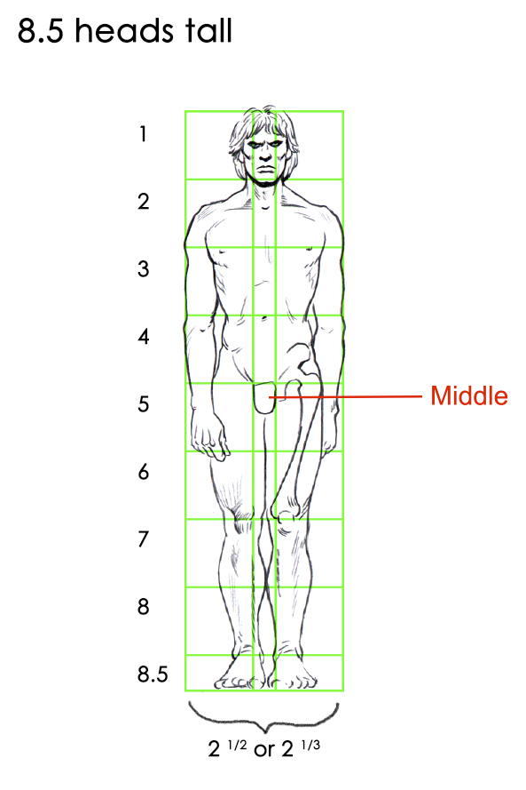
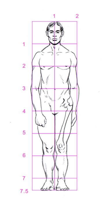
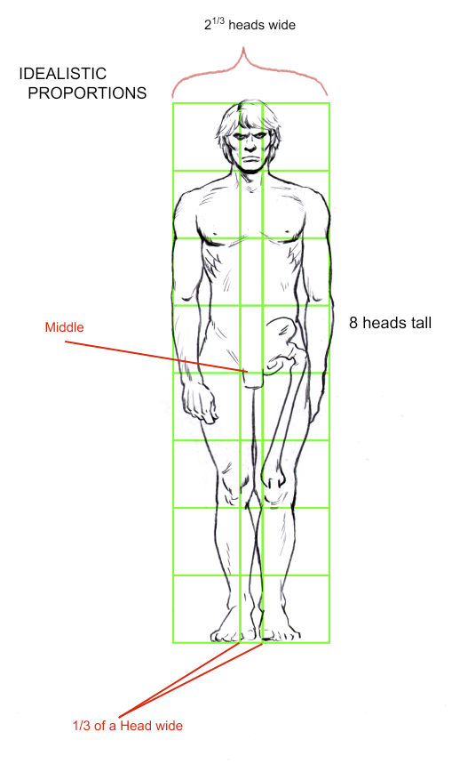
Most viewers who compare these proportions to the ‘naturalistic’ measurements used in the last posting will easily recognize how much more attractive the Idealistic Proportions appear to the eye.  That being said, this proportional measurement of 8 heads is not the final word on Establishing a Key Figure.  8 heads is only appropriate in some situations when drawing the human figure.

Artists who draw fashion illustrations, comic artists and even the sculptors of the Classical era use -and did use- greater proportional standards.  We will examine these proportions next week.

Thanks for reading, and I would like to wish you happy and accurate drawing.


Establishing a “key figure” Part 1

Greetings,

Today’s posting will combine some conceptual elements which Loomis has outlined in earlier sections of the book, with some rules which are better stated in his companion book “Figure Drawing for all its Worth” (which will be reviewed on this blog in time).  The concept Loomis is outlining is “Establishing a Key Figure”.  It is akin to his rule about setting up the relative heights between human figures standing in perspective.  The added element is exactly how does one properly determine a human figure’s height?

Before too much is stated, I want to  address some generic disputes which arise when discussion of humanity and attractiveness is considered.  In the following discussion, it is  considered that symmetry is more attractive then incongruence, and that upright, slightly elongated figures are more appealing to the eye, than are hunched and squat figures.  This model of beauty is defined by Classical aesthetics, and it has been the standard in the Western World for over 2000 years.  Contrary points of view are a derivative of the very recent movement of Post Modernism, and the full-frontal attack on Western Values.  Andrew Loomis does not consider Post Modern takes which subvert Classical definitions of beauty in favour of alternate positions.

Let us get underway by defining how one sets up the proper proportions of the human figure.

Many books outline the method of ‘measuring in heads’ to find out the attractive proportions with which to render a human figure.  Andrew Loomis uses the same method, but he adds many important considerations which are usually overlooked in other books.

Academic measurement of the human body is 7.5 heads tall.  This measurement is generally accepted as being true to reality, on average.  The particular height of a person is not altered by this measurement proportion method.  For instance, a 6 foot tall person and a 5 foot tall person could both be measured at being 7.5 heads tall, the difference being the head unit size would be larger on the taller person.

Furthermore, the average width of the figure is taken to be 2 heads wide.  This measurement is fully represented at the outer edge of the shoulder, as it turns down into the arm; basically in a line straight across the chest.

Here is a drawing I have done, measured at 7.5 heads tall.

knee7.5 heads tall

The problem with this measurement of the figure is that, despite it being accurate to life, it produces a figure which appears rather stumpy, and unimpressive.  As far as illustration is concerned, the choice to represent an idealized version of humanity is preferable, rather than representing a naturalistic version of humanity.

The measurement of the idealized version of the figure will be explained in the next posting.

See you then.